A/B Testing: The Web Version of Mice in a Maze
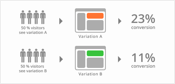
The name A/B testing, alternatively referred to as split testing, may sound slightly technical to some, but the concept is actually quite simple. Digital marketers use this technique to see which version of a page viewers like better; either version A, or version B, hence the name.
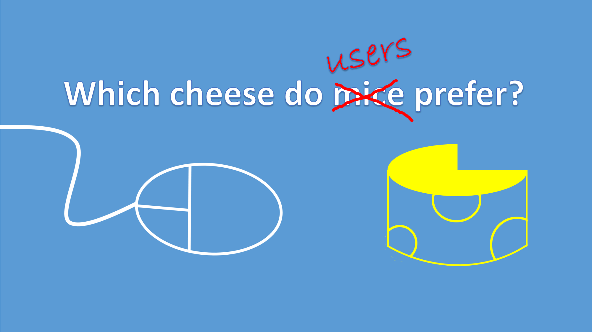
Think of mice in a maze. You have 100 mice and you split them into two even groups: 50 mice in Group A and 50 mice in Group B. At the end of the maze, Group A mice are rewarded with Gouda cheese and Group B mice are rewarded with Brie cheese.
You then calculate an average completion time for each group. Group A’s average time is three minutes and Group B’s average time is nine minutes. This would indicate mice prefer Gouda over Brie. (Fun fact: I just learned mice actually aren’t the biggest fans of cheese, but let’s get back on point.)
This is essentially the same thing digital marketers do when they create an A version and a B version of the same page. Viewer 1 sees version A, and viewer 2 sees version B. Version A may have a red “Subscribe” button whereas version B would have a yellow “Subscribe” button. You set the test to take into count 2,000 views, sending 1,000 people to version A and 1,000 people to version B. After the desired number of viewers is met, you’ll be able to see which “Subscribe” button received the most clicks; let’s say it was version A, the red button. Based on this information, you would make the “Subscribe” button red on all pages and likely see an uptick in conversions of people clicking the button.

It is important to keep in mind, though, that the only part of the page which can change is the color of the “Subscribe” button. I can still remember my high school biology teacher reiterating the point that to test only one specific variable, all other variables must remain the constant. This is the case for A/B testing. If you choose to change the content on display next to the “Subscribe” button, the above mentioned test would become invalid. People may be clicking the button not because the color was more eye appealing, but instead because they were interested in the content. You can only test one variable at a time in an A/B test; however, you can have multiple A/B tests across different pages.
A/B tests can help you discover optimal titles, photos, content on display, webpage design, email templates, etc. that lead to higher conversion rates, but setting up multiple A/B tests can get confusing, so be sure to organize what information you’re testing on which pages.
It’s also essential to make sure the parameters of your test groups are set properly. What does this mean? You need to specify which viewers are part of which tests. If they come from LinkedIn, they could be test group 1, split into two subgroups to see version A or version B of a page. If viewers come from Facebook, they could be test group 2, seeing version A or version B of the same page, but in a different A/B test (The LinkedIn group sees apples or oranges in the header; the Facebook group sees bananas or pears in the header). You would then be able to tell which landing pages people from LinkedIn like better and which landing pages people from Facebook like better.
For more detailed information, check out Visual Web Optimizer’s A/B Testing post. They also discuss how search engines such as Google react to A/B Testing and how this can affect your Search Engine Results Page (SERP) ranking.
You can purchase tools to help you with your A/B testing. Email marketing powerhouse MailChimp allows you to run A/B testing on the campaigns you send to subscribers, and if you use the free version (2,000 contacts or less), the A/B testing is also free. To add to the freeness, WPBeginner explains how you can use Google Analytics to set up A/B testing (for free) in a WordPress site.
Good luck and enjoy your experimenting!


